National Railway Power BI Dahsboard

This project was part of the Maven Analytics Rail Challenge . The challenge objective was to play the role of a BI Developer for National Rail, a company that provides business services to passenger train operators in England, Scotland, and Wales.
The result is an explanatory report that helps them:
The interactive dashboard:
Design / User Experience Choices
For this project I decided to use the Pareto Principle as the connecting thread between the first 3 pages. My goal is to make it easier and faster to understand for the user, as the format repeats from page to page and the user doesn’t need to “take in” a completely new format.
The slides follow a top-to-bottom approach – starting with the overall indicators and how the top N routes cumulatively contribute to the these indicators (the Pareto principle applies very well here), down to investigating individual top N routes selected by the user.
I kept the maximum number of routes to be selected at 10 (although this can be easily adjusted), because these generally explain 80% of the major indicators related to revenue, number of passengers and on time performance. This way, we can quickly identify the main revenue drivers, as well as the main pain points without getting lost in the entire list of routes.
Another choice that I made was to keep the number of filters to a minimum, although I initially considered including a filter pane. Even though this is an exploratory dashboard, I tried to make it a slightly guided experience. I find that when a lot of filters are available to begin with, it can be easy to make multiple selections that could lead to confusing results.
Some of the visuals do interact with each other, which leads to a more intuitive experience – clicking on a specific bar that attracts the user’s attention will lead to the filtering of other connected visuals.
Route Analysis – Top N Most Popular Routes
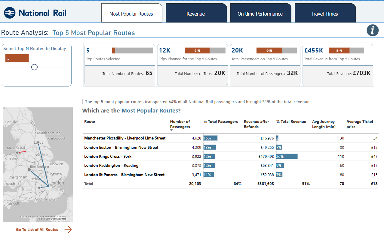
On this page the user can select the number of top routes they want to see based on the number of passengers.
When the slider changes the number of trips, the cards automatically update with the cumulative results for the top N routes. The small bar charts included in the card show how the top N routes contribute to the total - for example, top 10 routes accounted for 79% of the total number of routes.
The map also updates to show only the number of routes selected, and the matrix also updated with the corresponding routes. Clicking on an individual route will highlight it on the map.
Within the list of top N routes I included the number of passengers, as well as the revenue generated, as the latter usually matters the most to decision makers.
To explain the % difference between number of passengers and revenue (which I assume would be the first “Why?” when seeing the data), I added the average journey length and the ticket price, which should give a quick reasonable explanation.
Selecting “Go To List of All Routes” leads to a simple list of all the routes where they can be filtered and sorted by various indicators.
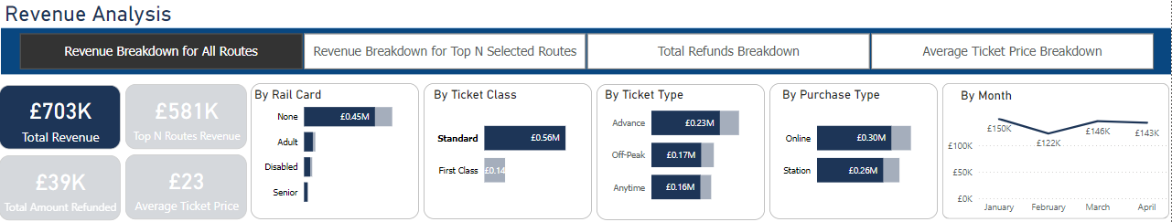
Revenue Analysis
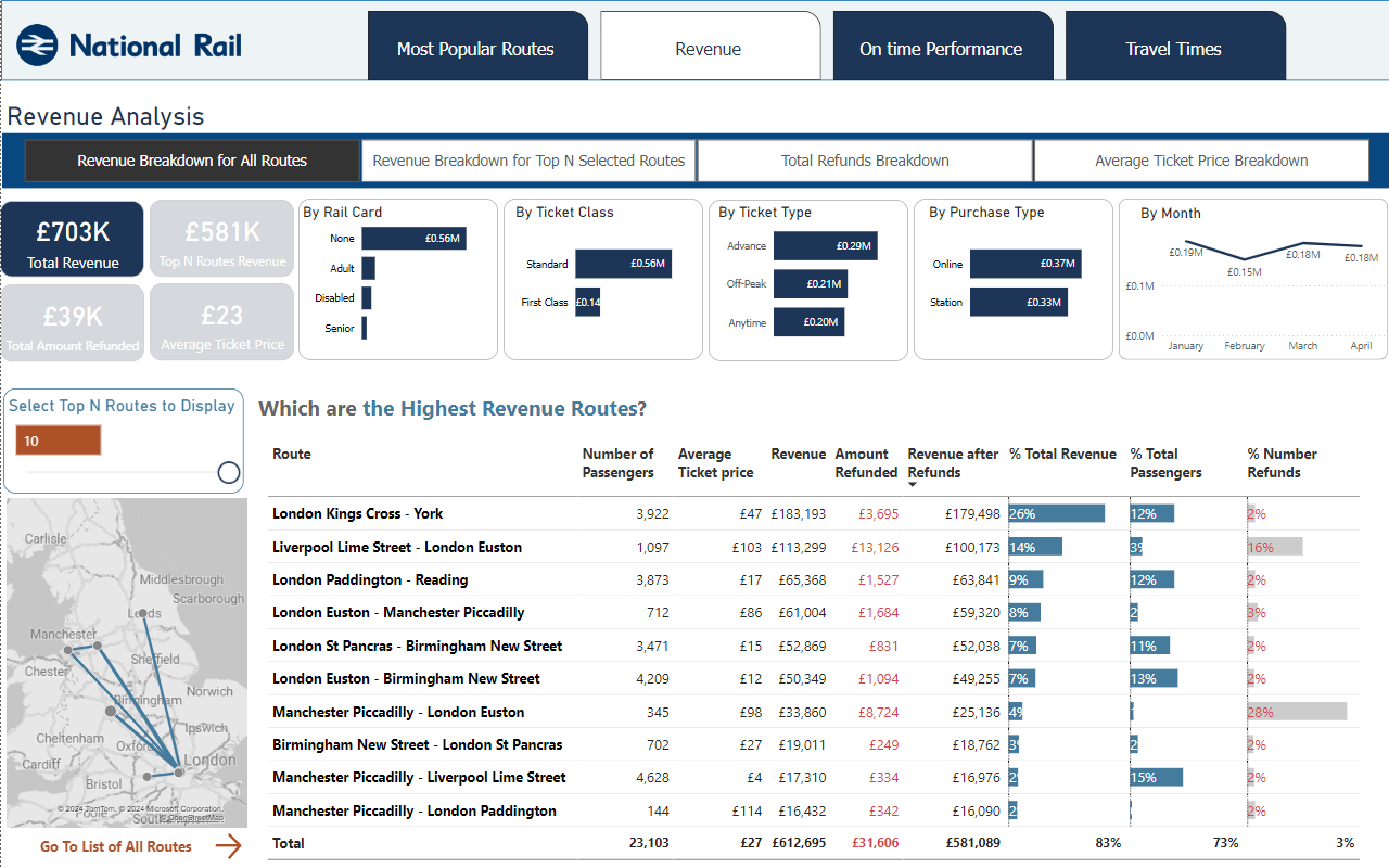
The Revenue Analysis starts with breakdown of the revenue by Rail Card, Ticket Class, Ticket Type, Purchase Type and Month.
The filter right below the title allows the user to see the breakdown based on different parameters – Breakdown of Total Revenue, of the Revenue for Top Selected Routes, of the Refunds, as well as a breakdown of the Average Ticket Price by all the categories mentioned.
I used color to make the connection between the total (or average) overall amount and the corresponding categories.
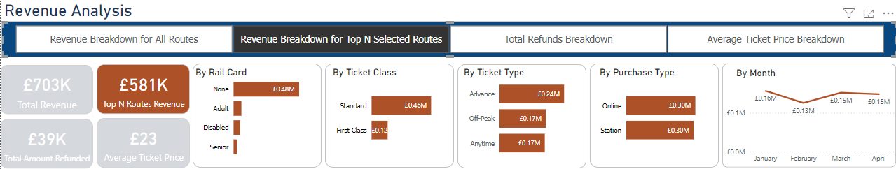
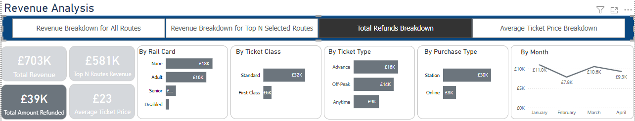
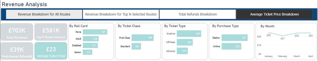
These visuals also interact with each other, so when selecting one bar (ex: Standard Ticket Class), we can see how it filters the other categories:
 Selecting an individual route from the matrix will also filter all the categories above and it will highlight the route on the map.
On-Time Performance Analysis
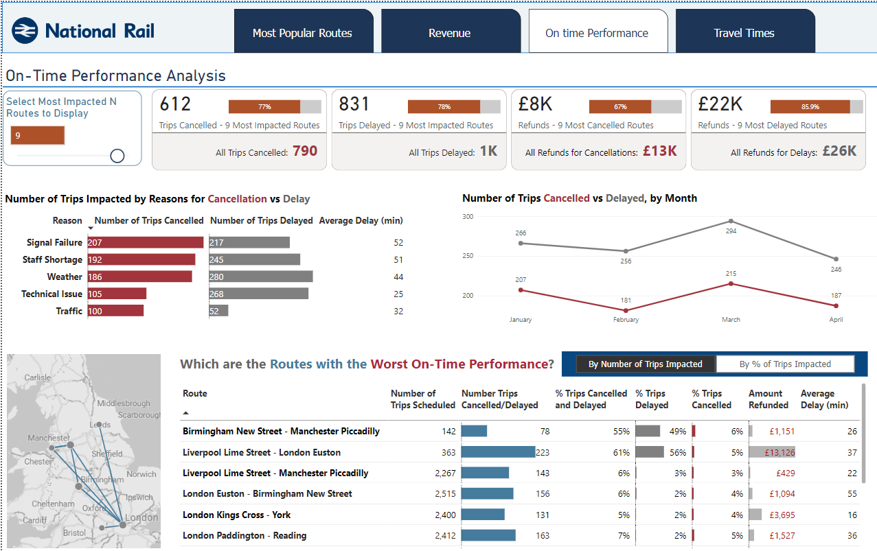 This page covers the main on time performance cumulative indicators for the top N routes selected – number of trips cancelled/delayed as well as the corresponding amount of refunds requested.
It also includes the number of trips by reason of delay/cancellation and a breakdown by month.
These 2 visuals, together with the map and the list of routes all interact with each other, making it easy to explore further.
For example - selecting an individual route will show us the number of trips by reason for delay/cancellations, as well as a breakdown by month:

The list of the routes with the worst on-time performance can also be sorted by number of trips impacted, as well as by % of all trips impacted.
Peak Travel Time Analysis
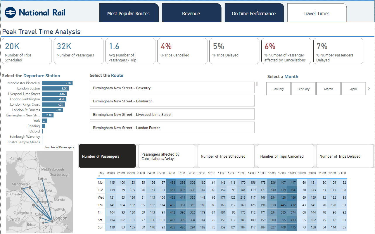
This page is the only one with a different format and it includes more filter options.
It is meant to allow the user to look for a specific departure station, route, or month and see various views of the daily and hourly traffic. The map will also update based on the departure station/route selected.
It also includes, besides viewing the number of passengers on each day/hour, analyzing alternate indicators at day/hour level:
- the number of passengers affected by cancellations/delays
- number of trips scheduled
- number of trips cancelled/delayed